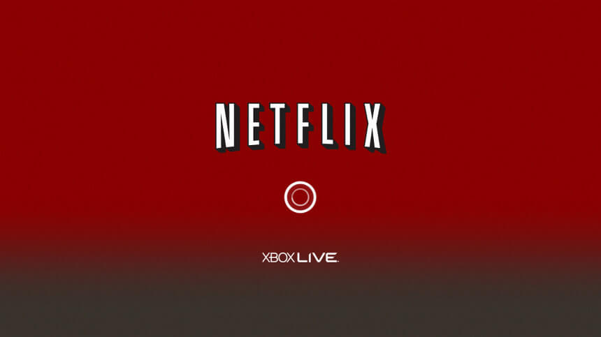
Netflix
Xbox App
- CLIENT: Netflix
- Innovation, delight, & fluidity with VUI voice interaction.
- Conceptual Design
- User Research
- Personas & User Flows
- Information Architecture
- Heuristic Assessment
- Wireframing
- Rapid Prototyping
- User Testing
- Style Guide & Hi-Fi Comps
- Rapid Prototyping
- Front End Development
- Delivery and Integration Support
Discovery
Finding the 'Why'
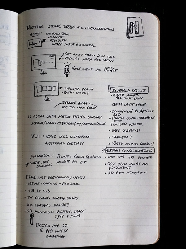
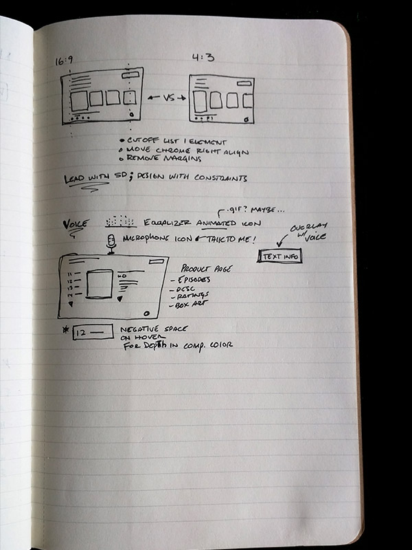
Data showed that 52% of Xbox live users hadn't switched over to HD televisions. Designing for 4:3 and the limitations that SD entails is the primary task. Designed for SD in accord with typography, icons, and images, then resize and scale for HD. 10 ft design is a challenge as whitespace is limited and moreso with standard definition compared to high definition.
Exploration
Past & Present
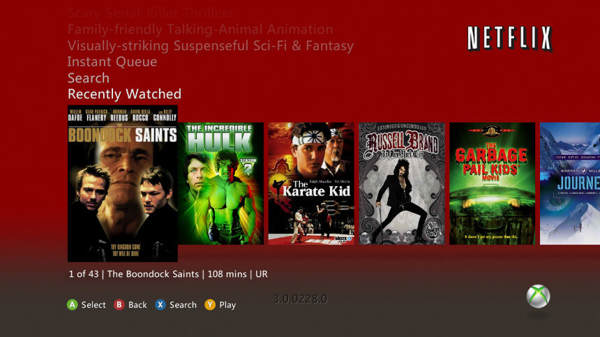
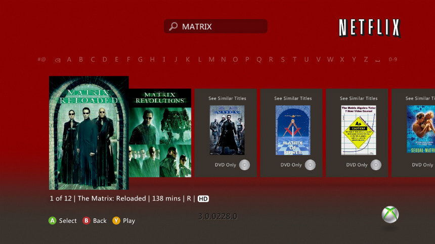
Xbox already had quite a bit of data from previous incarnations of the Netflix app, and Netflix did as well. It was interesting to see the bookshelf effect - populating a list of what users wanted to be perceived as to viewing, versus actual viewing. Fluid, fast UI is necessary and implementing Kinect party options was a feature most requested. Voice input is a primary objective for navigation.
Research
Device Type & Category
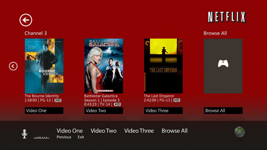
UX design for Netflix App on Xbox
The design goals were innovation, delight,
fluidity and adding in VUI voice interaction; while aligning with the Metro (now Modern)
design language.
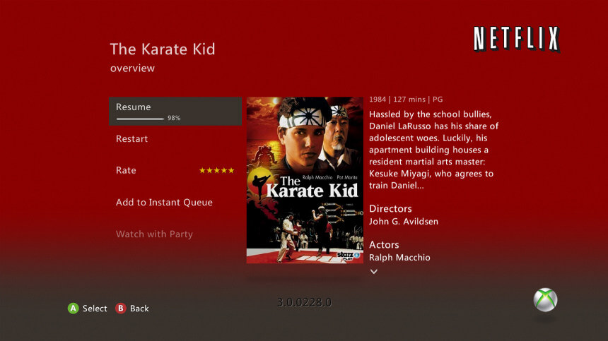
The main design challenges were designing for 10 foot user
presentation: adding larger images, designing for 4:3 first and 16:9 and adding party
options for Kinect users.
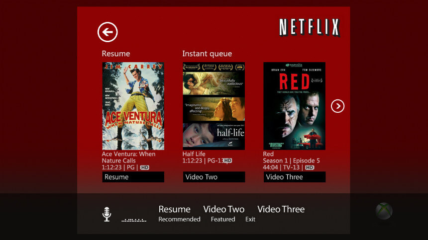
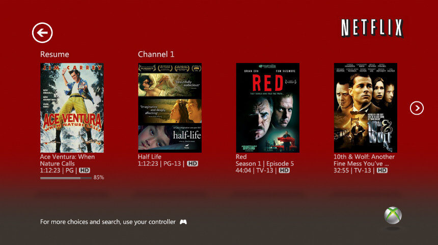
Analysis
Responsive Workflows
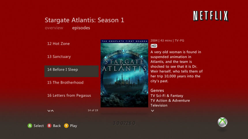
Working from SD first, the 'worst case' scenario allowed a pleasant transition to HD
with all the information intact. Other edge case issues were TV episodic data being
overly verbose with descriptions, SD typography, SD white space, and typography.
Ensuring navigation easily accessible with controllers.
Party watch was also added in as a highly requested feature.
Talk to me
Introducing Natural User Interface (NUI) was important to bring out the full capability of Kinect. It was a novel and interesting way to interact with the Xbox NXE and with Netflix as an app. On the localization side, it was a challenge, to say the least, to get everything working correctly. Lots of user testing here to ensure fluent control.
Launch
Several prototypes were coded by myself to adjust animations, parallax; while maintaining IA. Once the feel was correct, after many iterations, I moved on to high fidelity mockups. Additionally, SD and HD were fully supported allowed additional time for edge case displays, like monitors, PAL sets, and additional localization efforts.
This felt complete when it hit the design goals, was responsive and felt good to use and when the UX really allowed the user to shine. A brief moment to celebrate, then on to improving for the next version.
Chad Rawlinson
Design & Implementation
"Upon launch, the revamped Netflix app received widespread acclaim for its user-friendly design and responsiveness. It effectively transformed how millions of Xbox users accessed and enjoyed Netflix content, driving increased viewership and engagement. This project underscored the importance of cross-platform collaboration and user-centered design in developing compelling digital experiences."